


Designing a website UI isn't always easy. We normally immediately see fully designed websites, and the process of how one go there isn't understood easily. I will be doing weekly videos on designing different types of website UI's to help people understand the design thinking that goes into building such websites.
- Hero Banner
- Navigation
- Call to Action
- Using correct images
- Selecting colors
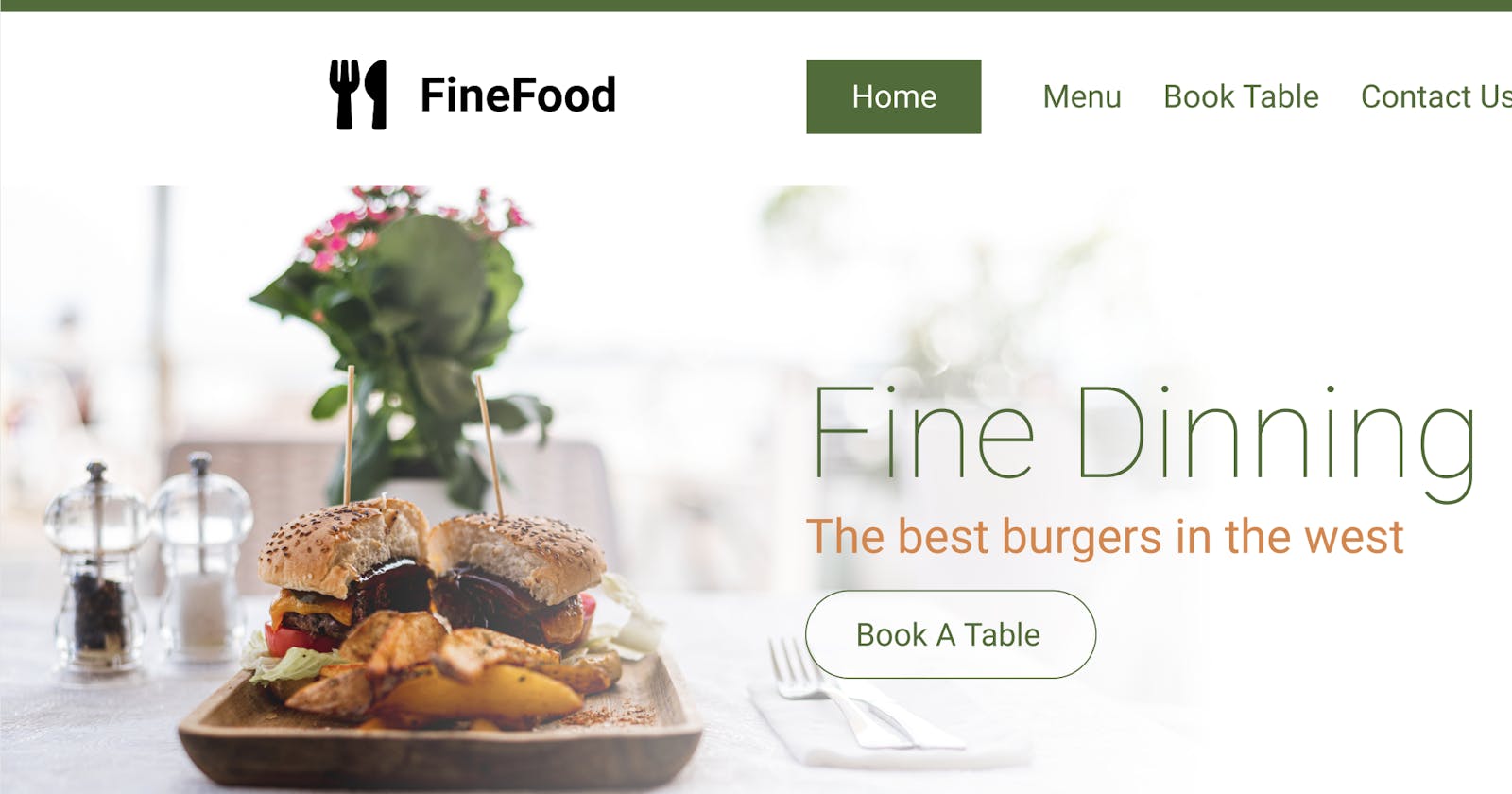
In this video, I build out a restaurant-style website design, which includes a number of elements. We create a hero banner by selecting an image that works well for food. The image in this case had some good white background blends so we can flow it directly into the hero title.
The navigation follows the same sort of elements, using colors from the image to stand out while also staying consistent to the rest of the brand. Menus these days aren't as obviously displayed, with less background color (usually only on the active element).
The call to action also is nice a clear, with three options that are defined with nice large images and text as the three most likely places people would be clicking. As a restaurant website, this would be the menu, and possibly specific food selections. Whenever designing the UI for any website, it's important to take these items into account.
I hope you enjoyed this short ~15 video, let me know and I'll try to do more content like this in the future :)
Follow and support me: 🐦 Twitter: twitter.com/adrian_twarog 💬 Discord: discord.gg/nGdThpE 💸 Patreon: patreon.com/adriantwarog 🖥️ Dev.to: dev.to/adriantwarog